A few months back, a client showed us their existing dashboard. It was built with a popular open-source charting library, and it looked fine in the demo with 50 rows of sample data. In production, with 15,000 rows and real-time price feeds updating every few seconds, the browser tab was consuming 2 GB of RAM and the charts stuttered like a slideshow.
Their operations team had started keeping a separate Excel spreadsheet because the dashboard was too slow to be useful during busy hours. When your dashboard is so sluggish that people go back to spreadsheets, you've got an expensive problem.
We rebuilt it using React and DevExtreme. The same data, same features, but the page now loads in under two seconds and handles real-time updates without flinching. Here's why that combination works so well for data-heavy business applications, and what we've learned from building these dashboards across trading platforms, analytics panels, and operations monitoring tools.
Why Dashboards Are Harder Than They Look
From the outside, a dashboard seems simple. Some charts, a grid or two, maybe a few filters. Most developers assume they can put one together in a couple of weeks with React and whatever charting library has the most GitHub stars.
Then reality hits.
The data grid needs to handle 50,000 rows without freezing the browser. Users want to sort by any column, filter by multiple criteria simultaneously, and export the filtered result to Excel with one click. The charts need to update in real time as new data streams in, but they can't re-render the entire component every time a single data point changes. The layout needs to work on a 4K monitor in the office and on a laptop screen at home. And the client wants a print-friendly version for their Monday morning meetings.
Each of these requirements is solvable individually. The challenge is solving all of them together, in the same application, without turning the codebase into a tangled mess of workarounds. That's where the choice of component library matters more than most teams realize.
What DevExtreme Brings to the Table
DevExtreme is a commercial UI component library by DevExpress. We've been using DevExpress products for over a decade across .NET and web projects, so we know the ecosystem well. The React version of DevExtreme includes everything you'd expect: data grids, charts, schedulers, form components, and more. But the parts that matter most for dashboard work are the things you don't see in the marketing screenshots.
Virtual scrolling that actually works. The DataGrid component can handle hundreds of thousands of rows because it only renders what's visible in the viewport. This sounds basic, but the implementation quality matters enormously. We've tested it against other virtual scrolling solutions, and DevExtreme consistently handles edge cases better: variable row heights, grouped rows, master-detail views expanding inline, frozen columns on horizontal scroll. These are the things that break in other libraries when your data gets large enough.
Built-in server-side operations. When your dataset is truly massive (millions of rows), even virtual scrolling isn't enough because you can't load all that data into the browser. DevExtreme's grid supports server-side sorting, filtering, grouping, and paging out of the box. You point it at an API endpoint, and the grid sends the parameters automatically. We've connected it to .NET Web API backends and Python Flask services with minimal custom code.
Real-time chart updates without full re-renders. The chart components support incremental data binding. When a new data point arrives from a WebSocket feed, you push it into the data source and the chart updates just that portion. No full re-render, no flicker, no performance degradation as the dataset grows. For a trading dashboard we built that displays live candlestick charts with 30-second intervals, this was non-negotiable.
Export and print support that isn't an afterthought. This is where open-source charting libraries usually fall short. DevExtreme grids export to Excel with formatting, column widths, and grouped data intact. Charts export to PNG and PDF. For the Monday morning report use case, this is the difference between "let me screenshot this and paste it into PowerPoint" and "click Export."
Real Projects, Real Scenarios
Let us walk through three dashboard types we've built with this stack.
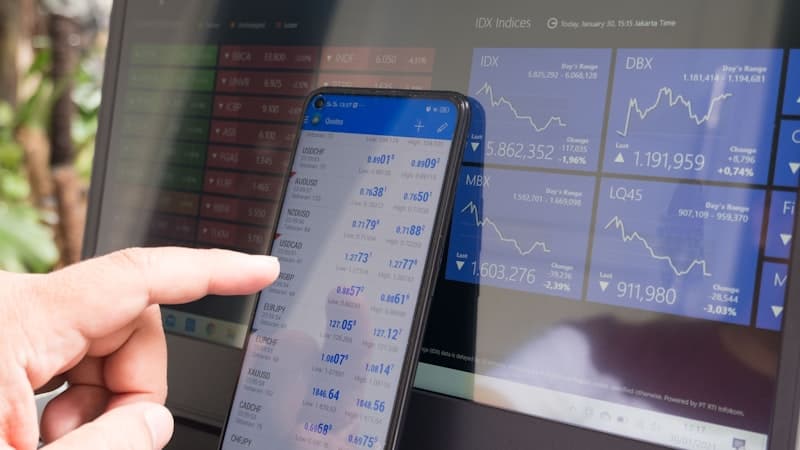
Trading operations dashboard. This one shows real-time market data, portfolio positions, order history, and P&L calculations. The grid displays about 8,000 active positions with live price updates streaming via WebSocket. Users need to filter by strategy, asset class, and date range, then drill into individual positions. We used DevExtreme's DataGrid with real-time data binding for the positions table and their chart components for the P&L curves. The dashboard handles market hours (when data is flying in fast) without any perceptible lag.
Analytics reporting panel. A client needed a dashboard for their marketing team to explore campaign performance data. Think 200,000+ rows of event data with 15 dimensions they wanted to slice by. We used DevExtreme's PivotGrid for the cross-tabular analysis and their standard charts for the visual summaries. The pivot grid's ability to handle aggregation client-side (for datasets up to about 500K rows) meant the marketing team could drag and drop dimensions and see results immediately, without waiting for server round-trips.
Operations monitoring tool. A logistics company wanted to track fleet status, delivery completion rates, and driver performance in real time. The dashboard combined a map view with data grids showing active deliveries and a set of KPI gauges. DevExtreme's Scheduler component was repurposed as a timeline view for delivery windows. The whole thing runs on a wall-mounted TV in their dispatch center, refreshing every 10 seconds.
Why Not Just Use D3.js or Chart.js?
This comes up in every conversation about dashboards, so let's address it directly.
D3.js is extraordinary. It's the most powerful and flexible visualization library available. If you need a highly custom, one-of-a-kind visualization that doesn't fit any standard chart type, D3 is the right choice. But building a production dashboard with D3 is like building a car from individual parts when you could buy one off the lot and customize it. You'll get exactly what you want, eventually, after spending five times the development budget.
For a custom scatterplot with novel interaction patterns, use D3. For a business dashboard with grids, standard charts, and export functionality, you'll spend months recreating things that DevExtreme gives you out of the box.
Chart.js is good for simpler use cases. It's lightweight, easy to learn, and produces nice-looking charts. But it doesn't include data grids, doesn't have built-in export, and starts struggling with performance once you push past a few thousand data points with real-time updates. We've used Chart.js on projects where the visualization needs were modest and the budget was tight. For data-heavy enterprise dashboards, it runs out of road.
The DevExtreme trade-off is cost. It's a commercial product, and the license isn't cheap. But when you factor in the development time saved (and we're usually talking about weeks, not days), the math works out clearly in favor of the commercial library for enterprise projects.
How We Structure These Projects
Our typical dashboard architecture with React and DevExtreme looks like this:
The React application handles state management, routing, and layout. We use component composition heavily. Each dashboard widget (a chart, a grid, a KPI card) is its own React component with its own data connection. This means widgets can load independently, so the user sees the fast-loading components first while heavier ones are still fetching data.
Data flows through a combination of REST APIs for historical data and WebSocket connections for real-time feeds. We typically put a thin caching layer between the API and the components so that switching between dashboard tabs doesn't re-fetch data that was loaded 10 seconds ago.
For styling, we customize DevExtreme's built-in themes to match the client's brand. The components are designed to be themed, so you're not fighting the library to make it look right. We've matched them to existing design systems on multiple projects without resorting to CSS hacks.
The responsive layout uses CSS Grid for the overall dashboard structure. DevExtreme components handle their own internal responsiveness (grids hide less-important columns on smaller screens, charts adjust their legend position, and so on).
Performance Lessons
After building quite a few of these, we've collected some patterns worth sharing.
Don't load everything at once. Even with virtual scrolling, loading 500,000 rows of data into the browser on initial page load is wasteful. Load what's visible, prefetch the next likely view, and lazy-load everything else.
Batch WebSocket updates. If your real-time feed sends 50 updates per second, don't re-render 50 times per second. Batch them into 200ms windows and apply them together. The user can't perceive the difference, and your CPU will thank you.
Memoize aggressively. Dashboard components that depend on derived calculations (totals, averages, percentages) should use useMemo to avoid recalculating on every render. We've seen dashboards get 3-4x faster just from proper memoization.
Profile before optimizing. React DevTools and Chrome's Performance tab are your friends. We've caught situations where a tiny tooltip component was re-rendering thousands of times because of a missing memo wrapper. Always measure first.
Is This the Right Fit for Your Project?
If your dashboard needs to handle more than a few thousand rows of data, support real-time updates, include export functionality, and look professional without months of custom styling work, the React + DevExtreme combination is worth serious consideration.
We've built enough of these to have a solid starter architecture that accelerates new projects. If you're planning a dashboard, or struggling with one that doesn't perform well enough, reach out to us. We're happy to talk through the technical approach before any commitment.